I've never wrote blog post before so let's see how it goes, feel free to leave any feedback that would help me improve.
So you want to create a Sailfish OS application? Great! First step you should take is to design it!
Before you run away and say you don't have time for designing hear me up. I'm not asking to create mocks or draw something, instead just imagine your application. Think how it will work, how many pages you need, how to layout it. And then while working on it just follow that initial image of it. Couple minutes of thinking about how it should look and work like shouldn't be too time-consuming :)
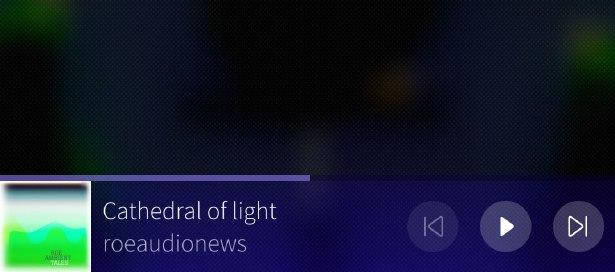
Onto designing app itself, there is all kind of apps, so I'll try to be as general as I can. Let's think about how many pages you need. Usually app is centred about first page, from which you can go to settings or about page through Pull-down menu. If you want to do some action about the page, for example add new element, also put it in Pull-down menu instead of buttons. In general limit buttons as much as you can. If you need more pages try to fit them in Pull-down menu, and if its impossible and you have many (5 or more) pages then tab layout might be your only option. If you need something to be easily accessible no matter what you are doing on first page, use attached page instead of panel on bottom. Try to avoid adding panel on bottom like on picture below.
Pull-down and Push-up menus, how do they work?
There are some, probably unwritten, rules about them. Optimal amount of entries is 3, and maximum is 5. In apocalypse-level extreme cases 7 is allowed but if you really need to add 5 you are doing it wrong so consider doing it in different way. And so because of that never ever use those menus as delegate in list that has theoretically no limit.
Other than that they are menus, just menus. Don't try putting weird things there. In one example, somebody put label "Settings" on top of "Settings" entry. Don't need to tell us it's settings two times, one is enough. In other, worse case a person put a volume slider in there. Just don't, it's menu that you are supposed to pick option from and nothing more than that.
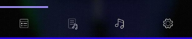
Tab layout, the evil.
Tab layout is unofficial layout used in multiple apps. Lately Jolla added tab layout in dialler app, but they did super terrible job so please don't do what Jolla did.
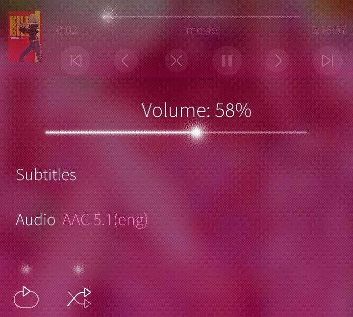
Why tab layout is evil you might ask. Simple reason is that it fits every app. You can think of any app and every single one of them would work using tab layout. That's why it's so evil, we have Sailfish OS not Android so don't make Android out of it. That's why tab layout only should be used in super specific cases when you have many pages and you just can't work it around using Pull-down menu. For example, I've found that music players fit tab layout perfectly. You need page for current playlist, library, files, playback control, settings and it just fits tab layout perfectly. But if you can then avoid it at all cost.
I've got first page, how do I go to other pages?
I've seen multiple apps with first pages that had grid with about 6 buttons that are used to go to different pages. This is pure evil and please never do that. There is nothing Sailfish-y or pretty about it, it's pure ugliness. Use first page as a main page of program that user will always come back to and put any additional pages in Pull-down menu.
Also, good practice is something I have in all my apps that I call "One click principle". Basically after launching app you just need one click to achieve app's purpose. In microtube, when you click list entry, you are watching YouTube video which is what entire app is about, in Musikilo after you, well hold list entry, you get music playing, in PicoPlayer a video player, after one click you have video playing. This will make your app dead simple, super easy to use and very ergonomic.
Last and most important rule.
KISS aka Keep it simple stupid. If you have to heavily modify components, you are doing it wrong. Grab some examples from documentation and use things as they were intended to. Paradoxically, the less time you spend on customizing UI, the better it will look.
Also, we've just started, with other community member, a GitHub organization where we will put pretty components and code examples you can use in your apps. I'll be putting every code example I use in this blog there too. So that you can just grab pretty example or component and use it in your app therefore hopefully making entire app ecosystem more pretty, which is all that this blog is about.